I should probably have held off until today to post this one. As it was, the changes I had planned to make to this when I last posted it were all that it needed. This one (whisper it) might even be finished.
Friday, 26 March 2010
Wednesday, 24 March 2010
More (almost) newness

I've updated my site today. There were a few paintings that I had not got around to shooting, which I wanted to add. These date from mid-winter and were made when I wasn't quite certain where I was going and so instead reworked some existing pieces, whilst I mulled over ideas.
I've also added most of the on-going pieces that have been shown here over previous weeks. All of these can be seen in lovely big, zoomify-sized images.
A world of new

 New versions abound today. First up are the new versions of canvases A, B and C. These have been on-going for a few weeks now and I think may finally be nearing an end stage.
Canvas A has had minimal changes from the last time. I've added some drawing and a portion of a photo, no more. I don't think this one is likely to change again.
Canvas B, however, is quite a bit different from last time. Here there are more washes of colour, as well as some very obvious splattering, which does indeed have a slight unwelcome pink tint (note to self: always be sure and clean your implements). There are also two different layers of drawing, much of which I have now obscured, and a poem. Yes. A poem. It may be a touch pretentious. Deal with it.
Canvas C is the most changed. I was quite unhappy with this in its last guise and have therefore greatly reworked it: new plaster layering, a white wash, re-tinting the letters, orange splahes and a stamp. (I like stamps.) Lastly I added a little drawing. I'm still not certain how I feel about this one but time will tell. I've put it on the wall, along with the others, to consider over the coming weeks.
Esto también pasará
This one has been hacked about quite a lot in the past few days. I've already covered over quite a lot of what I first did to it and I expect more of that is going to happen yet.
Thursday, 18 March 2010
You will not die, it's not poison
I've got a lot of ideas swimming about in my head at the moment. Adding typography to my paintings is one of them, the idea being to add order to what is otherwise chaos.
My liking for type comes from my work as a magazine designer and for me that absolutely represents my ordered side. I enjoy it greatly and trying to find ways to bring that into my painting is a challenge. So far, I've been sticking to painting simple large letters. Here I've gone for a different approach entirely. I'm really pretty happy with how this has turned out, although ideally the paper would be thinnner.
There are a few other things here worth mentioning. The first is an addition of a photo, which I attempted to merge into the painting. I'm not too happy with how this particular instance turned out and so have covered a lot of it up with the type.
Secondly, there are the wires that are strung between carpet tacks, hammered into the outsides of the stretcher frame. I like how this looks and will almost certainly try it again. Hopefully I can get them to rust as well next time, although that may well might require using chemistry, which will almost certainly hurt my head.
Labels:
collage,
drawing,
mixed media,
painting,
photo,
plaster,
typography,
wire,
work in progress
Tuesday, 16 March 2010
Number nine is not number nine yet might be the first finished
This is the first piece that I think might be finished. It is the first one where I am happy with both the balance and number of elements. To begin, I laminated a bunch of dead notebook pages onto one part of the canvas. A few days later I began the plastering layer. Rather than wait for that to dry, I immediately painted into and over it but was unhapy with the results. When I added more, it got worse. I then mixed some drawing ink and PVA and splatted that around and about. It got worse again.
At this point I was on the verge of giving up on this one and letting it dry completey, before painting over the whole thing and starting again. Instead, I got out the palette knife and mashed everything together, except for the stringy black PVA strands. These I picked off and dumped over the notebook pages.
Oddly, this last-ditch, f**ck-it approach pulled everything together. So I added in the blank Instax photo, a few more orange splashes to balance things out and left it to dry. The next day I knew that it needed a large number 9 in the corner (I added two) and then a few more odds and ends.
The two most sucessful features for me where the last two added. The penultimate was the ink drawing, based on a light-trail photo I took last year. I've been trying to work drawings into my paintings since canvas A but this is the first time I feel it has really worked.
The final element, and the one I'm most excited by today, is that orange-ish strip in the centre. It is a long slot cut through the canvas, cross-stitched and backed with a mis-printed photo. The photo is stuck on the back in a D-shape, giving depth.
I've had this idea of cutting into the canvas in my head for many months, yet this is the first time I've put it into practice. It has worked exactly as I had hoped it would. This is great because I've got quite a few more variations on this idea I want to explore. So watch this space.
Saturday, 13 March 2010
Canvas C
I thought for this painting, I'd try a little harder to keep track of the stages it goes through. The previous two works-in-progress that I have uploaded here don't give quite as clear an indication of how they progressed, concentrating, as the mostly do, on details. Therefore this time I set out to make a record of the pregoress of this painting.
First up is the simple plaster background layer, with the main 'erosion' drips running across it. Once this layer hard dried, I cut out a space for the instax self portrait photo. Next up is the lettering layer and a splash of black ink and some other little odds and ends.
Finally there is a skyline drawing, filled below with a faint dark wash. This is overworked with some strips of a mis-printed photo and some oil and water colour mixing. There is also probably more ink here.
As with the previous two canvases, this piece is not finished. I'm still feeling my way about with this and don't yet know where it will go. Right now I am in two minds about this piece. On one hand I like the more obvious layering of elements, which is one of the things I've been trying to achieve. On the other hand, it feels somehow like a student project, a little amateurish, maybe even slightly tacky. I can't put my finger on exactly what is giving me this impression, whether it is the overyl clashing colours or just that there are two many disparate elements. I'm going to have to think about this one for a while, before I come back to it.
First up is the simple plaster background layer, with the main 'erosion' drips running across it. Once this layer hard dried, I cut out a space for the instax self portrait photo. Next up is the lettering layer and a splash of black ink and some other little odds and ends.

Finally there is a skyline drawing, filled below with a faint dark wash. This is overworked with some strips of a mis-printed photo and some oil and water colour mixing. There is also probably more ink here.

As with the previous two canvases, this piece is not finished. I'm still feeling my way about with this and don't yet know where it will go. Right now I am in two minds about this piece. On one hand I like the more obvious layering of elements, which is one of the things I've been trying to achieve. On the other hand, it feels somehow like a student project, a little amateurish, maybe even slightly tacky. I can't put my finger on exactly what is giving me this impression, whether it is the overyl clashing colours or just that there are two many disparate elements. I'm going to have to think about this one for a while, before I come back to it.
Thursday, 4 March 2010
Canvas B
I started this one last week, you may recognise a small part of it. Since then, I've added quite a bit to it.
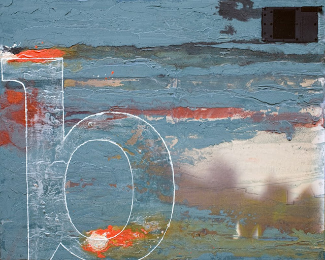
My primary intent here is to try to marry painting and photography. This is not the only method I've thought of for trying this, but it is the first to make it onto canvas. I'm not certain of its sucess. I'm also uncertain as to whether or not to work on this piece more. There are several parts of this that I like, however it doesn't feel finished yet.
As with canvas A, I'm going to put this away for a while and come back to it. (By which point I'm sure I'll be really wishing I had got the b straight.
Wednesday, 3 March 2010
Overcooked
Canvas 'A', as I am rather obviously calling this at the moment, has been simmering away for a few weeks. I think I might have been cooking it too long. There was a point last week when I was happier with it but I've gone past it now. What I really need to do now is to put it away somewhere for a few weeks and come back to it fresh. Maybe it will be cleared then.
Labels:
collage,
drawing,
font,
mixed media,
painting,
plaster,
stamps,
work in progress
Tuesday, 2 March 2010
Lagrangian point
I've spent ten years filtering my creativity though the ordered side of my personality; the chaotic side was utterly banished. It was never a conscious choice, in fact almost entirely the opposite. I became disconnected from my art because it was an expression of only half of who I was – an utterly ordered person is not the same at all as one who walks the line between order and chaos.
An Lagrangian point is a point in space between two astral bodies where their gravitational pulls are equal and so cancel each other out. A third body placed at this point will be attracted towards neither and will remain stationary. This is where I want to be, in between order and chaos, feeling the pull of both but moving towards neither.
An Lagrangian point is a point in space between two astral bodies where their gravitational pulls are equal and so cancel each other out. A third body placed at this point will be attracted towards neither and will remain stationary. This is where I want to be, in between order and chaos, feeling the pull of both but moving towards neither.
Subscribe to:
Comments (Atom)


